Fest Fish concept
Summary
Fest Fish is a rebranding concept for Euro-Trans. It includes a new name, new logo and a consistent visual identity based on the local folklore.
Client
PHT Euro-Trans
Roles
Art direction, design & naming
This project is a rebranding concept of a company that was owned by a relative of mine. The redesign was part of my university thesis and was not realized.
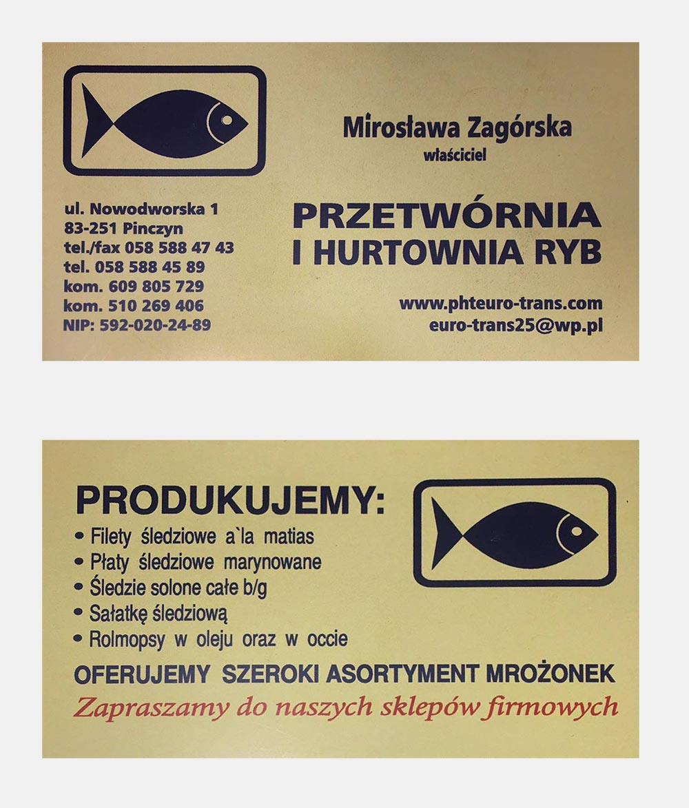
Euro-Trans was a company that did preparation and wholesale of saltwater fish products to local schools, restaurants, prisons and other large institutions. A local shop for retail customers was also present.
Problem
- Misleading, generic name.
- Generic logo.
- Lack of a consistent visual language.
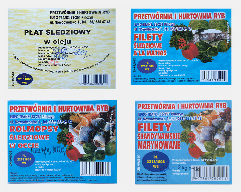
- Poor quality business cards and product labels with no information hierarchy.
Concept
Naming
The name Euro-Trans is generic and it could be mistaken for a logistics/transportation company. Before I started thinking about a new name for the company, I wrote down some guidelines:
- The new name should be connected to the industry somehow.
- It should be short and simple, thus memorable and easy to communicate over the phone.
- It should be unique. Different from the competition and the .pl domain name must be available.
- It would be beneficial if it would somehow relate to the local folklore of Kociewie.
The name I came up with Fest Fish, fits within the guidelines. The simple English word fish is widely used and understood. The word Fest is an adjective from the Kociewie dialect and means strong, big or good.
Logo
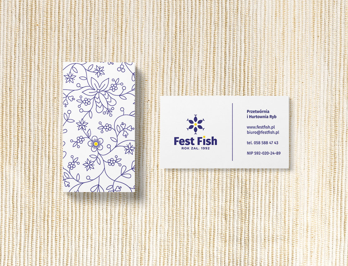
Before I started designing the logo, I researched the history and culture of the Kociwie ethnocultural region. The thing that left the biggest impression on me was the colourful, floral embroidery. It inspired me to develop a visual language based on them. In the logo, I created a flower shape where the petals are the reused fish shape from the original Euro-Trans logo.
![]()
Packaging
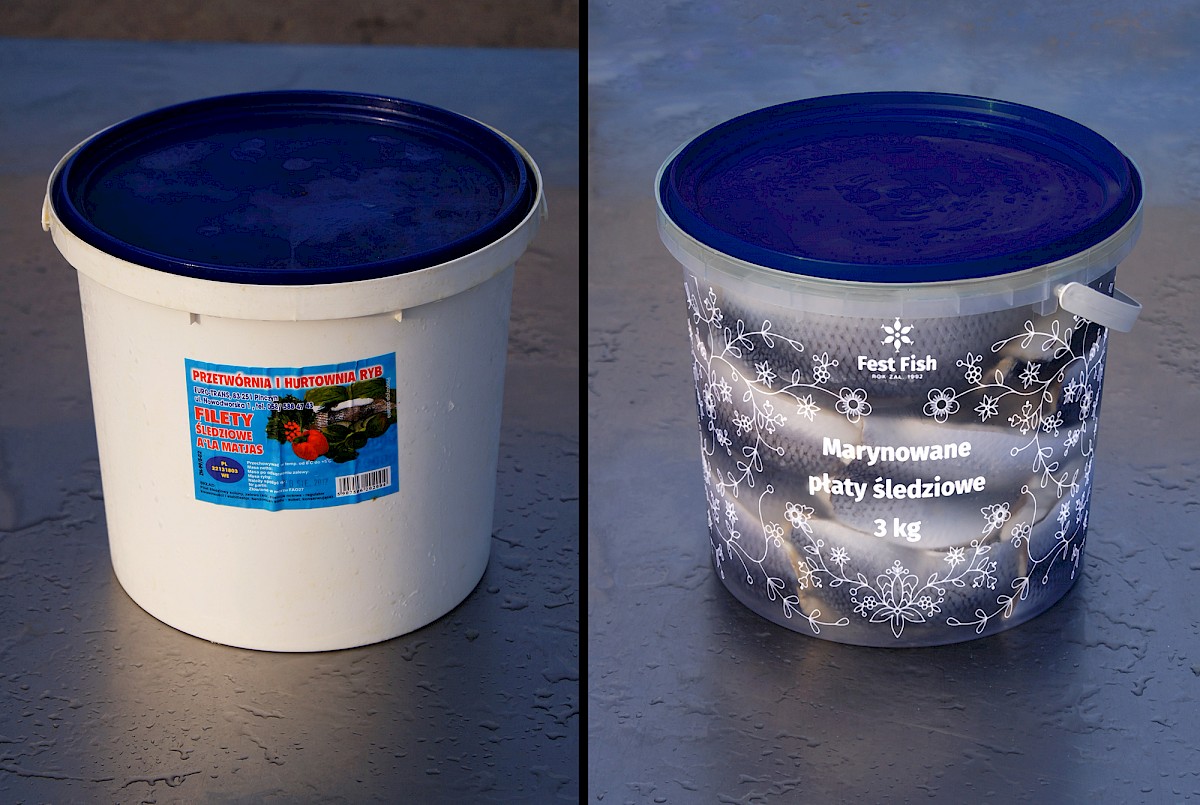
The fish were sold in plastic containers with volume ranging from 0,3L to 8L. Either white or transparent. All the necessary information was contained in a number of universal labels. While using the same transparent containers, I changed the label to a more elegant design that covers the whole container. I decided to display all the most important information on the front and move all the rest to the back.

Euro-Trans packaging on the left and a mockup of the newly designed concept on the right.
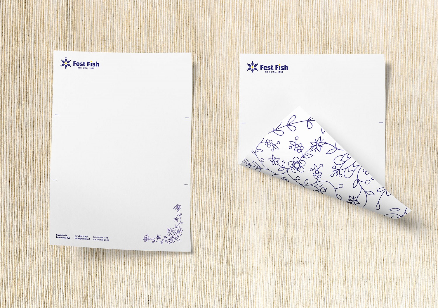
Additional printed materials